Your shopping cart is currently empty.


Configure Product
Checkout
Upload Artwork


Can't find what you're looking for?
Artwork Setup Guide
Download our Artwork Setup Guide
Are you new to designing files for print? It can certainly be a confusing and enormous process to undertake. Not only preparing your design, but also ensuring your project is correctly set up for print. Creating a design that works well to fit your brand on paper can also be a minefield which we can help you to navigate.
How to set up your file
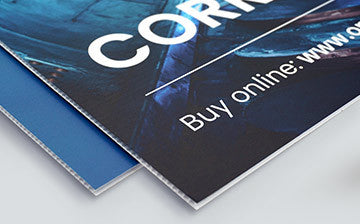
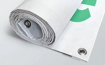
There are several things you’ll need to consider when initially setting your file up, this practical guide will walk you through the main processes. No matter whether you’re designing a flyer, business card, a banner or any other printed material from One Printer, we'll point in you in the right direction.
Templates – All of our products have templates which can be accessed via the product pages. Visit PDF Template Guides
Sizing – There will usually be a set-up with the correct sizing, we would recommend checking the style guide to avoid any mistakes.
Bleed – The area added to the edge of your artwork which includes any blocks of colour or background design which reaches the edge of the page. To create a bleed, simply extend your image, colour or text 3mm over the edge of the page.
Quiet Border – The area within your artwork which does not contain text, images or logos (unless they bleed off the edge.) We recommend at least 3mm, but preferably 5mm, from the trimmed edge of your artwork. We also recommend all borders are at least 3mm (ideally 5 mm) thick to ensue an even finish when trimmed.
Resolution – Referring to the sharpness and quality of an images provided. The higher the resolution, the better quality the final printed product you will receive.
Images – Imagery used in any artwork files for small format print should be high resolution, the standard for which is 300dpi (dots per inch).
RGB – When designing things for digital usage such as websites or graphics, you’ll more inclined to use to the RGB Colour mode. This is the usually the default setting for most graphic design applications like Photoshop or Illustrator
CMYK – Imagery used in you’ll need to use the CYMK colour mode as using RGB can lead to untrue colour representation during the printing process.
Black – Your artwork should use the colour value C0 M0 Y0 K100 for all black text. We’d recommend using black only for any text below 12pt. For black fills, we recommend C40 M0 Y0 K100 for a 'cool' rich black, or M 40 K 100 for a 'warm' rich black.
Spot Colours – Keep your colour setting as CMYK and use the swatches available in the colour library within the colour palette. These are Pantone®colours.
Ink Coverage – Avoid colours exceeding a maximum of 300%. We utilise corrective software to reduce any ink coverage down this cut of point. You can work out the total prior to submitting by adding the C, M, Y and K values together.